

Digital Design
Create a stronger online presence with digital design that is thoughtful, engaging, and built around your brand. From custom websites and EDM campaigns to social media content, UI & UX design, and digital banner advertising, I create tailored digital solutions that not only look professional but also connect with your audience. Every design is crafted to feel seamless, purposeful, and easy to use — helping your business communicate clearly across every digital touchpoint.
CASE STUDY 01
Social media &
promotional templates
GenesisCare
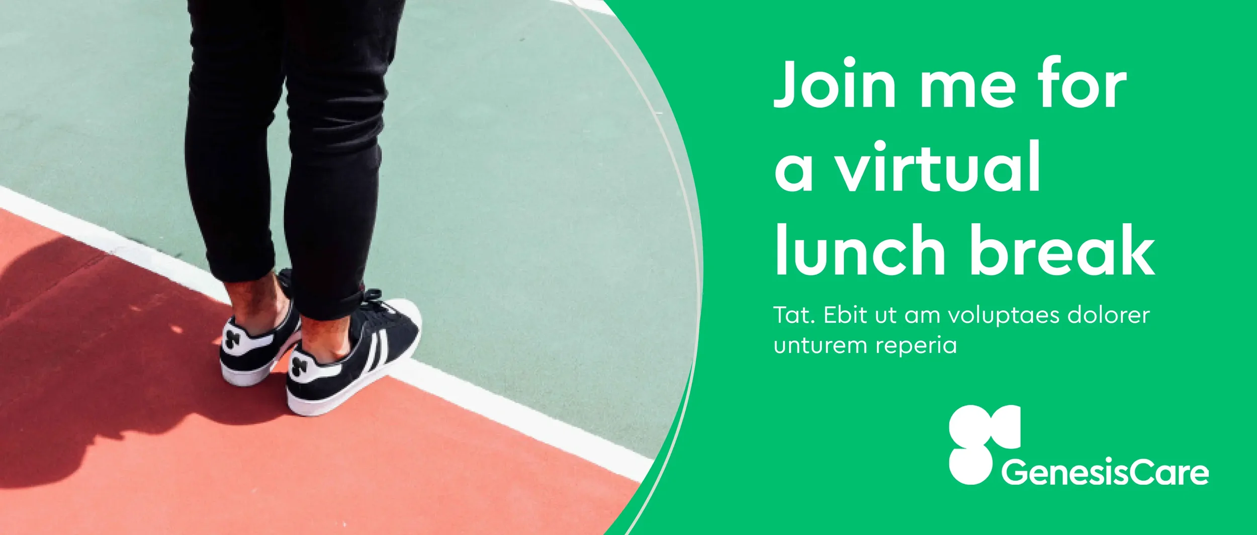
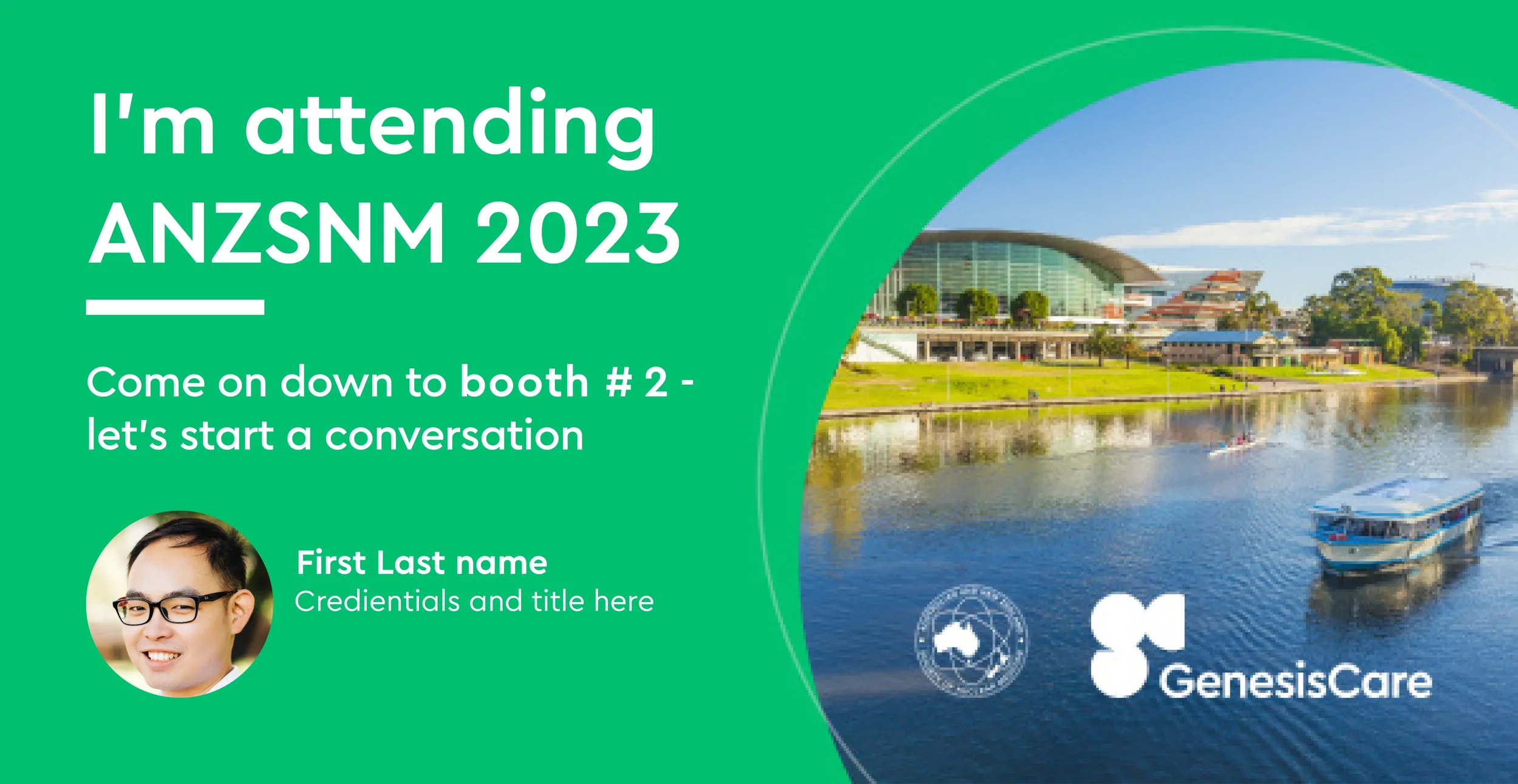
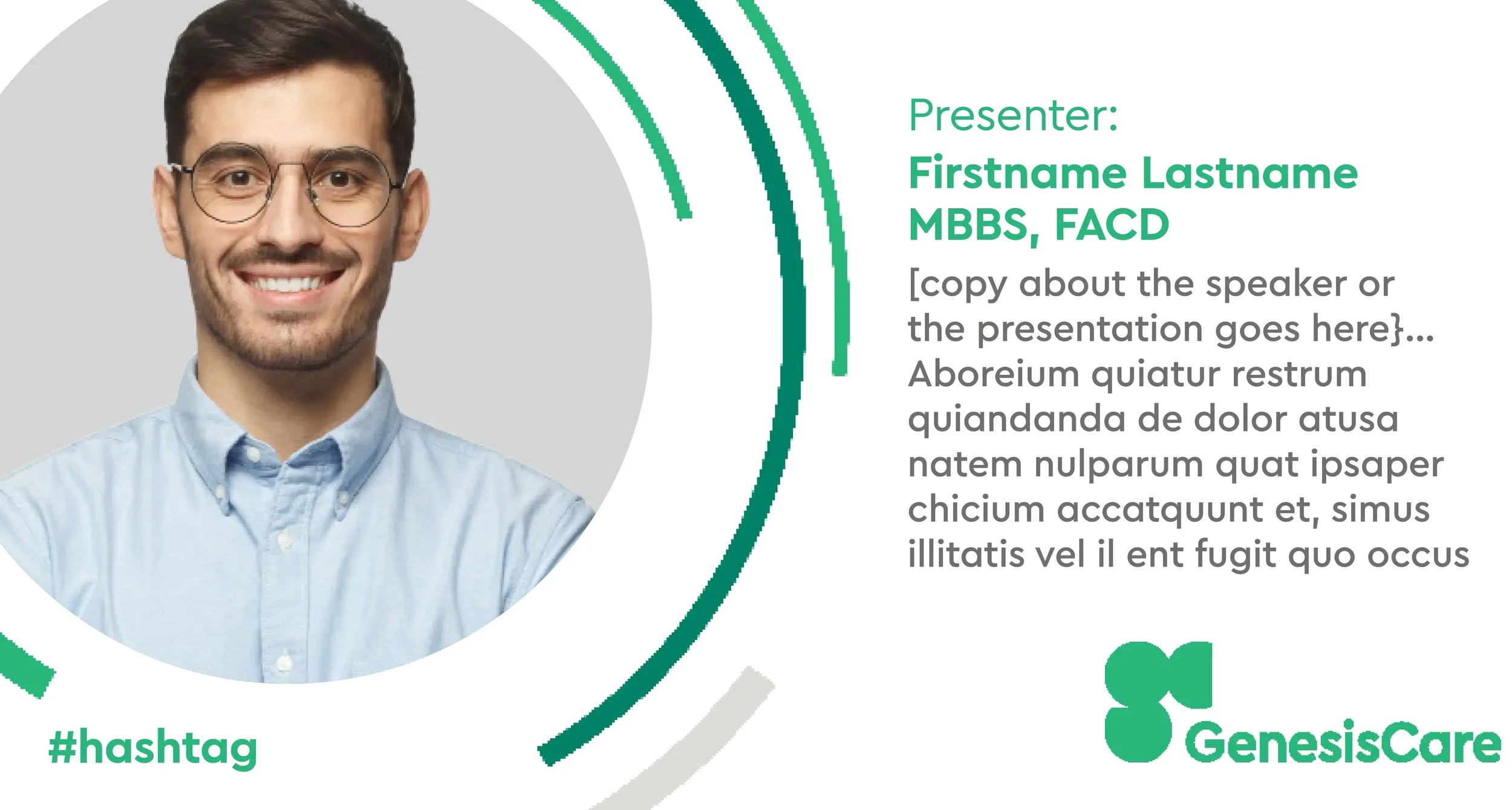
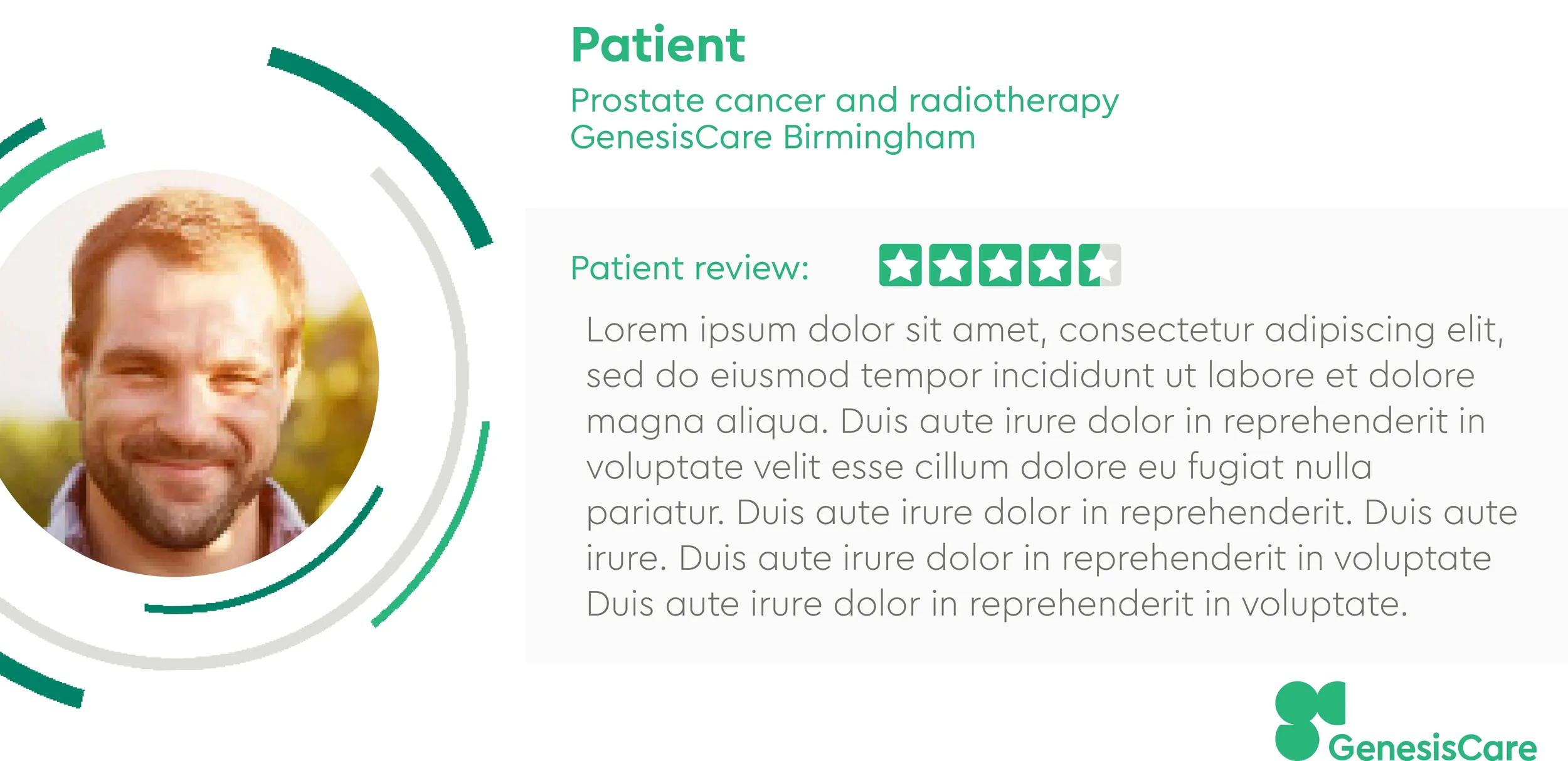
During my contract with GenesisCare part of my work was to develop a suite of cancer-focused social media and promotional templates designed for use across multiple digital platforms, including LinkedIn, Instagram, and Facebook. The brief required strict adherence to their established brand guidelines, ensuring all assets remained consistent with their existing minimal, clinical, and patient-centred design approach. The goal was to create flexible, easy-to-use templates that could be adapted by clinics and healthcare professionals while maintaining a unified and professional brand presence.
Using Adobe InDesign, Photoshop, and Frontify, I translated their existing style guide into a practical set of communication tools. The design approach focused on clean layouts, generous use of space, and carefully selected brand-aligned imagery to support sensitive healthcare messaging with clarity and empathy. Each template was structured with a strong typographic hierarchy to ensure information remained accessible and easy to read across both digital and print applications. The final outcome is a cohesive, scalable system of assets that empowers GenesisCare teams to communicate effectively while staying fully aligned with their brand identity.
CASE STUDY 02
UX course final project
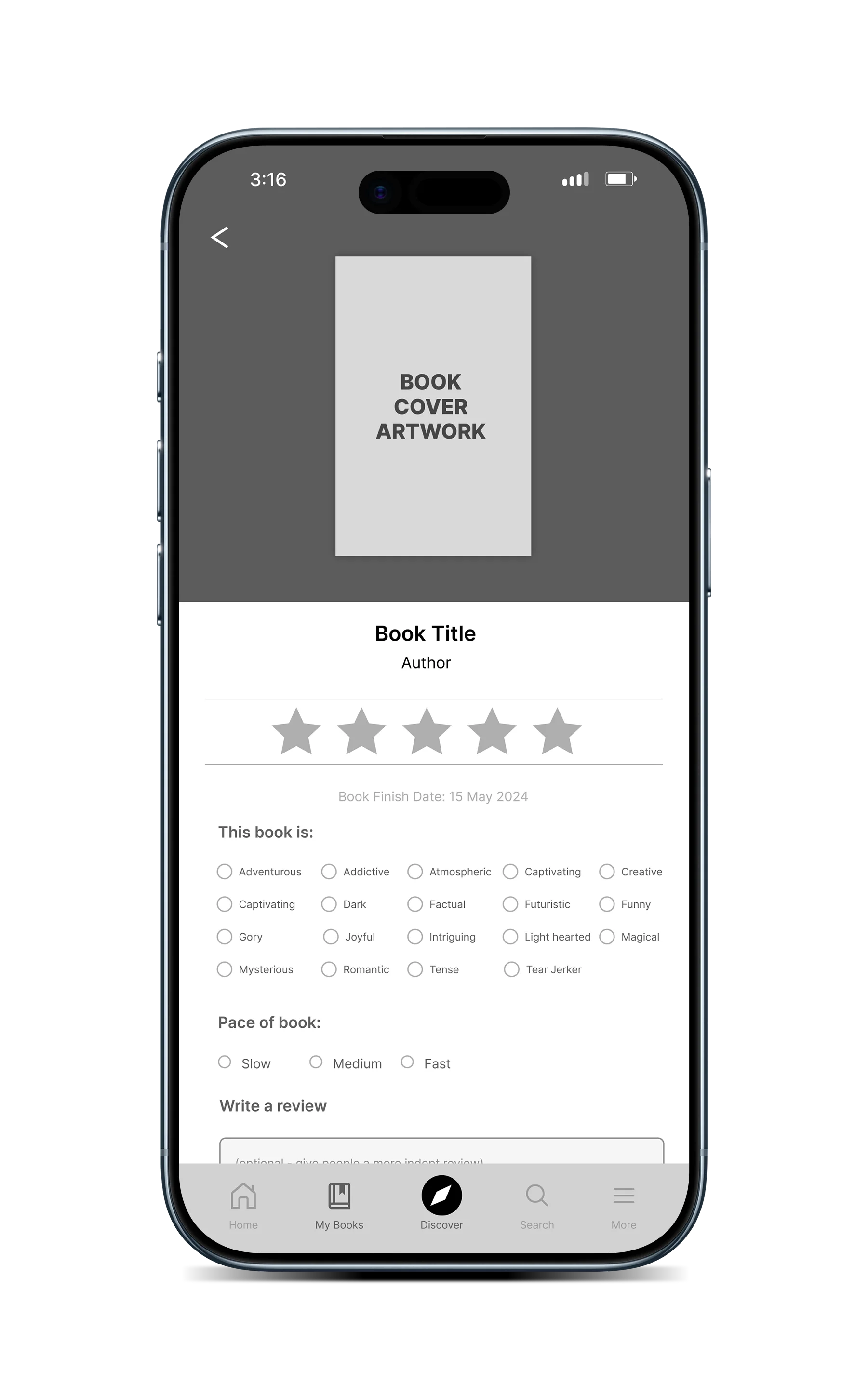
Goodreads
For this UX case study, I focused on the Goodreads app, a platform I had personally used for over a year prior to beginning my UX course. Through regular use, I identified a recurring issue within the review experience: while the process of leaving a review was simple, the output lacked depth and relevance, and did not meaningfully influence how I engaged with book discovery, or influence my decision in reading that book. To validate this assumption, I conducted user interviews with other Goodreads users, which confirmed similar frustrations—many users felt that reviews were often generic, unhelpful in decision-making, and that writing them did not feel particularly worthwhile or engaging.
Using a standard UX research and design process, I explored how the review experience could be restructured to better serve both individual users and the wider reading community. My goal was to improve relevance, encourage richer contributions, and increase overall engagement with the review system. I developed a redesigned review flow that was triggered once a user marked a book as finished (or updated their reading progress), guiding them through a more structured but still intuitive sequence: a star rating system (including half-star ratings), categorisation of the book’s key themes, pacing feedback, and an optional in-depth written review. I also introduced additional contextual options such as trigger warnings, spoiler tagging, and a “Did Not Finish” (DNF) marker to better reflect real reading experiences.
Following usability testing with participants, I refined the flow based on feedback, focusing on reducing friction while maintaining the added structure. Users found the process simple to navigate but significantly more meaningful in terms of contribution, particularly appreciating the category tagging and pacing feedback as tools that improved the usefulness of reviews. The final outcome created a more engaging and community-driven review experience, encouraging users to provide richer insights while also improving how reviews could be interpreted by others when discovering new books.

CASE STUDY 03
Nutritionist website
vitalogic.com.au
Vitalogic is a wellbeing-focused brand led by Melanie Moffatt, a writer, nutritionist, and holistic wellbeing specialist. The goal of this project was to create a digital presence that reflected her approach to health—clear, grounded, and uplifting—while also feeling modern and approachable.
Melanie came with a clear direction: she wanted a minimal website with a bright, vibrant feel that communicated health and wellbeing at first glance. While she had an existing logo, she was open to creative direction across typography, imagery, and layout, allowing the design to evolve naturally around the brand’s personality.
The design process focused on simplicity and clarity, ensuring the content and message remained central while the visual design supported the brand’s ethos. The structure of the site was designed to guide users intuitively through Melanie’s services and philosophy, creating a calm and engaging browsing experience.
The finished website successfully reflects the essence of Vitalogic—simple, vibrant, and health-focused—while giving the brand a professional platform to grow its audience and communicate its offerings clearly.
CASE STUDY 04
Mailchimp Quarterly
Newsletter template
Australian Pituitary Foundation
The Australian Pituitary Foundation approached me to design a custom Mailchimp template for their quarterly newsletter, with the aim of creating a format that felt professional, approachable, and easy to read across both desktop and mobile devices. Working within their established brand guidelines, I carefully applied their existing colours, typography, and imagery to ensure the final design remained consistent with their wider communications while improving the overall reader experience.
The focus of the project was to develop a clean and structured layout that would make important information easier for members to navigate. I created a clear visual hierarchy throughout the template, allowing content to feel organised without becoming overwhelming. Every design decision was made with accessibility and usability in mind, ensuring the newsletter could deliver information in a way that felt engaging while still maintaining a professional tone.
To give the foundation greater flexibility for future campaigns, I developed two separate newsletter templates. The first was a streamlined design centred on presenting general information in a clear and readable format, while the second introduced icons and supporting imagery to help distinguish sections and create a more visual reading experience. Together, these templates provided the Australian Pituitary Foundation with a versatile email solution that could adapt to different types of content while staying true to their brand.
CASE STUDY 05
Spotify album cover
Ese Nacho
For The Parks album cover, Ese Nacho approached me with a collection of photographs he had captured himself, which he wanted to incorporate into the final artwork. To fully understand the direction of the project, I spent time listening to the music and discussing the style, mood, and overall aesthetic he wanted the cover to convey. This early collaboration helped create a clear creative direction that reflected both the sound of the album and his personal vision as an artist.
From there, I developed several initial design concepts that explored different ways to bring the imagery and music together visually. Each concept was carefully considered to ensure the cover would feel authentic to the project while also standing out across digital streaming platforms. Through an open and collaborative design process, I worked closely with Ese Nacho, refining the artwork based on his feedback until the final design captured exactly what he had envisioned.
The completed album cover was delivered in the required formats for both the desktop and mobile versions of Spotify, ensuring the design remained strong and recognisable across all screen sizes. The final result was a polished and cohesive visual identity for The Parks that complemented the music and gave the release a professional presence across the platform.
CASE STUDY 06
Mailchimp
EDM campaigns
Axecom
Axecom engaged me to design a series of electronic direct mail campaigns (EDMs) that would clearly promote their premium high fibre internet for businesses, home internet solutions, and communication services. The goal was to create a clean and professional design that aligned with their established brand while presenting their services in a way that felt approachable and easy for customers to understand.
The design approach focused on simplicity, consistency, and usability. Using Axecom’s existing brand assets as a foundation, I incorporated custom illustrations alongside imagery the client had carefully curated over the years to create a polished and cohesive visual experience. Each EDM was structured to highlight key service offerings with clear messaging, balanced layouts, and strong calls to action that encouraged engagement without overwhelming the reader.
A key priority throughout the project was ensuring the emails were readable and user-friendly across both desktop and mobile devices. Every design was carefully optimised for responsive performance so the content remained accessible and visually consistent regardless of screen size. The final result was a series of professional EDMs that strengthened Axecom’s brand presence while effectively communicating their internet and communication solutions to their audience.
CASE STUDY 07
Digital banner campaign
Purple Bricks Australia
For this project, I worked with Purplebricks Australia to develop a digital banner campaign that aligned with a series of 11 television commercials created to promote the business. The goal was to ensure each banner felt like a natural extension of its corresponding commercial while maintaining a consistent look and feel across the wider campaign. This helped strengthen the connection between the video content and the digital advertising experience for viewers online.
Each banner was designed using a carefully selected screenshot from the relevant television commercial, allowing the campaign visuals to remain instantly recognisable across multiple platforms. I paired each image with the unique message from that specific advertisement, using a clean and simple layout that prioritised clarity. A strong visual hierarchy was applied throughout the designs to make sure the key message remained easy to read and impactful, even within smaller digital formats.
The final campaign included responsive digital banners for both desktop and mobile, ensuring the creative performed effectively across a range of online placements. These banners appeared on major web platforms including Domain and Apple News, where consistency, readability, and brand recognition were essential. The result was a polished digital campaign that supported the television advertising and delivered a seamless brand presence across multiple channels.
Let’s create something purposeful
If you’re looking for a designer who values clarity, impact, and strong execution—let’s connect.