

Print & Campaign Design
Print and visual campaigns are where clarity, structure, and storytelling converge.
I design brochures, posters, direct mail, and promotional materials as part of cohesive communication systems—built to translate ideas into visually disciplined, impactful outputs across multiple formats.
Each piece is considered within a wider campaign logic, balancing hierarchy, composition, and intent to ensure consistency, recognition, and clarity across every touchpoint.
CASE STUDY 01
Cancer Promotional Material & Communication System
GenesisCare
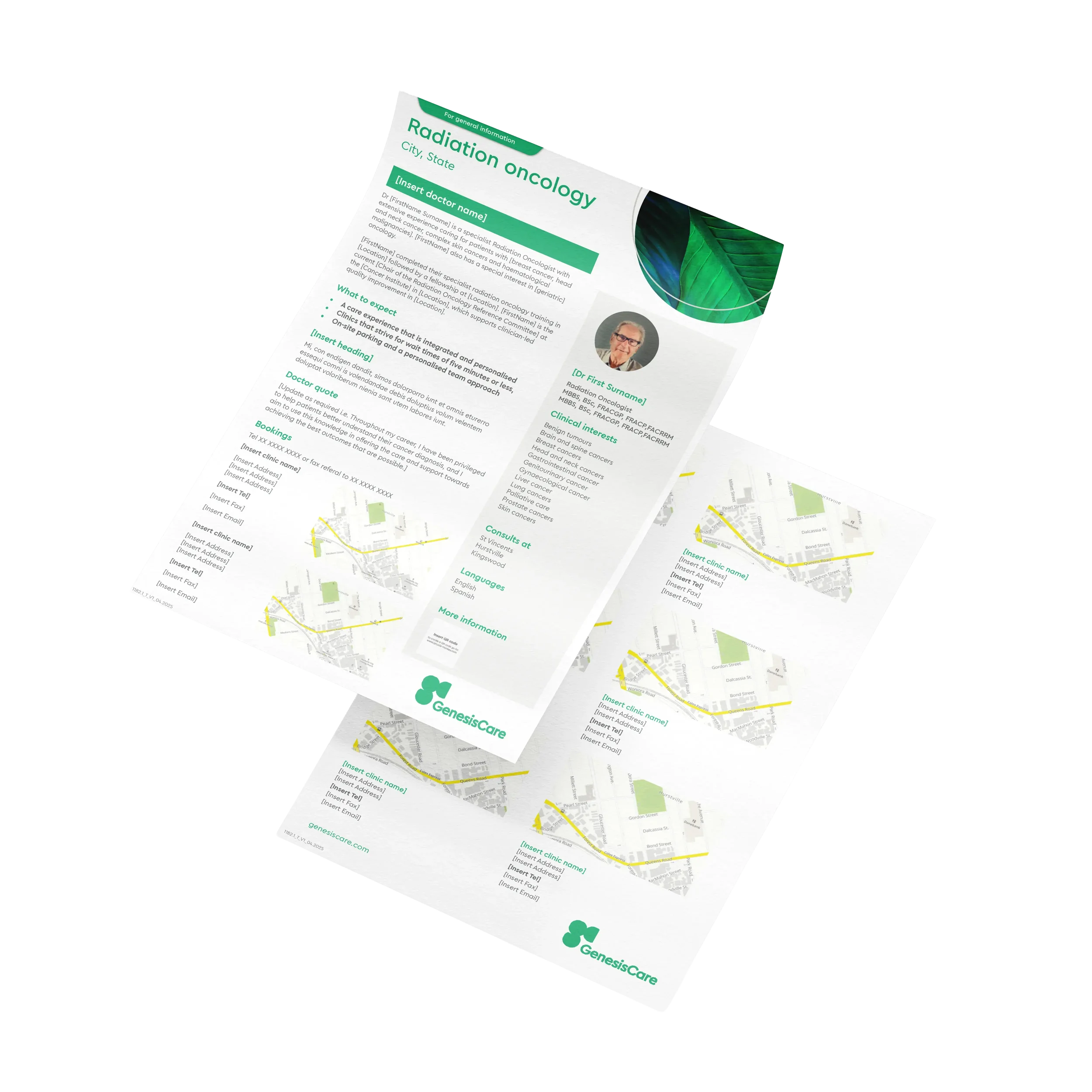
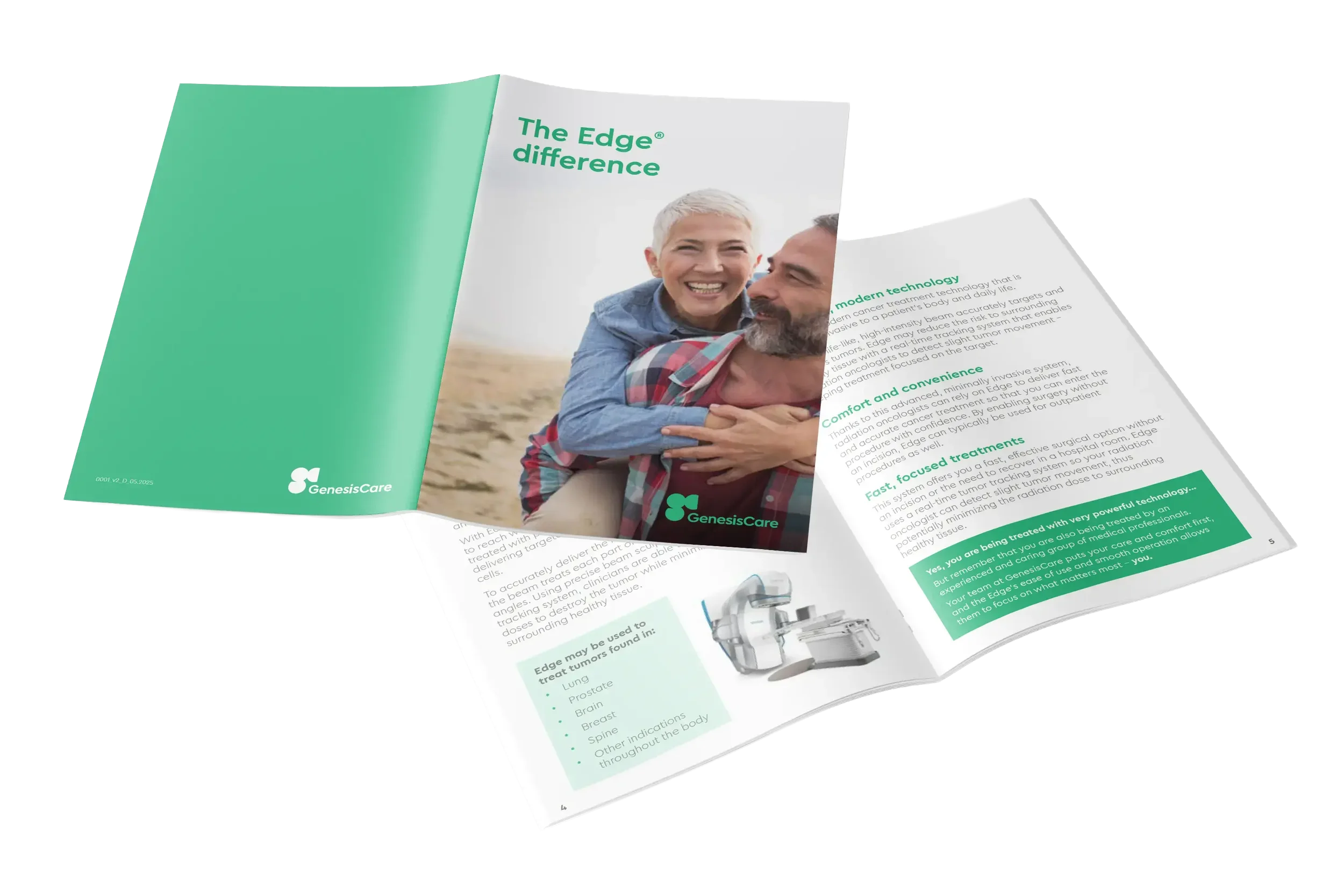
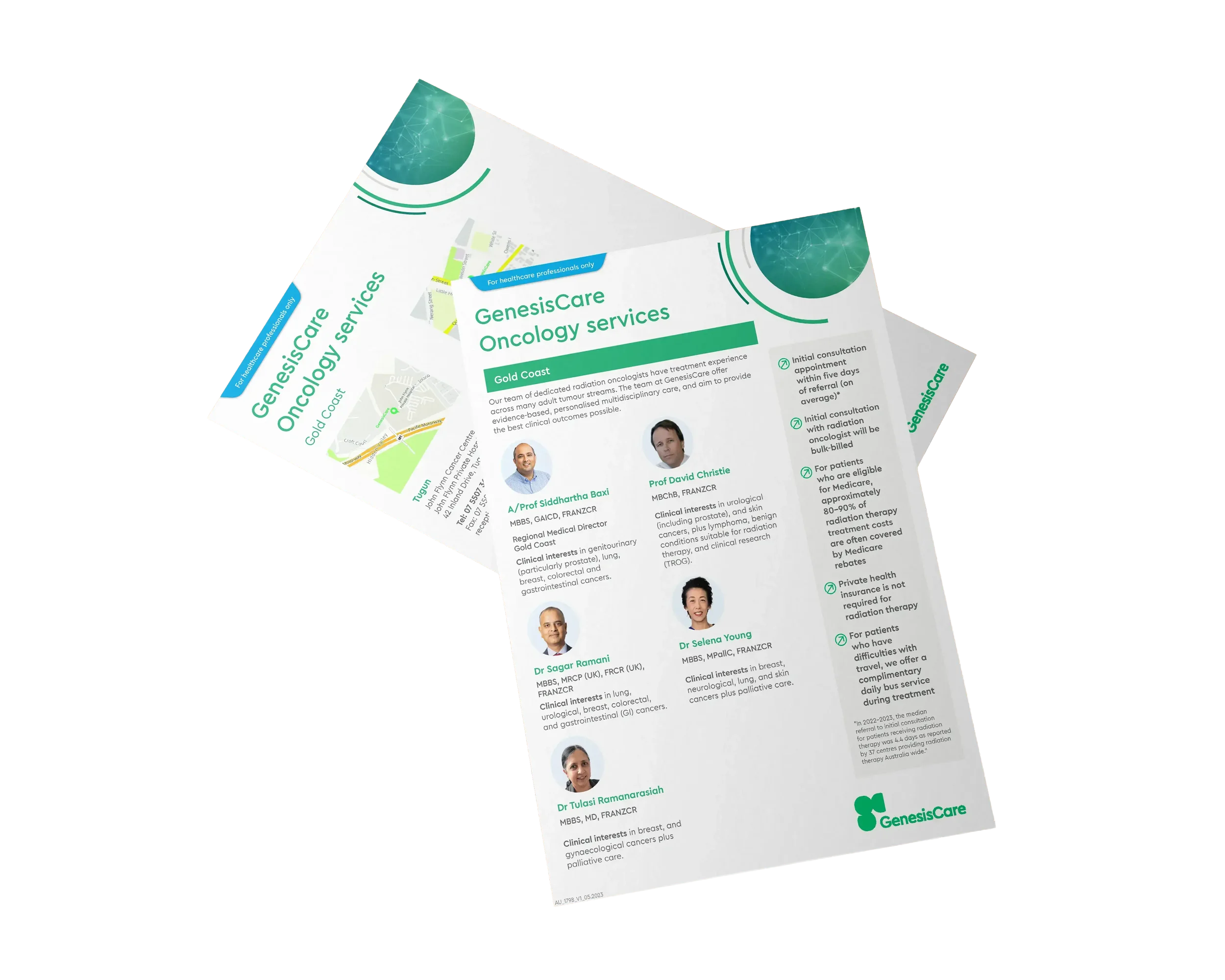
During my contract with GenesisCare I worked to develop a suite of cancer-focused promotional materials that aligned closely with their established brand guidelines and patient-centred approach. The project included a range of collateral such as doctor profile templates, service templates, services brochures, as well supporting informational flyers. The objective was to ensure every piece felt consistent across the wider brand while presenting complex healthcare information in a way that was clear, approachable, and easy to navigate for different audiences.
Using GenesisCare’s existing visual identity, I applied their clean, minimal design style through careful typography, generous white space when possible, and structured layouts that supported readability without overwhelming the reader.
Alongside producing the collateral, I was also tasked with developing a new labelling system that could be rolled out across future promotional materials to clearly distinguish content intended for healthcare professionals, patients, and general information. This created a more intuitive communication framework across the brand, helping improve usability while maintaining a cohesive and professional design system across all touchpoints.
CASE STUDY 02
A5 Promotional Flyer
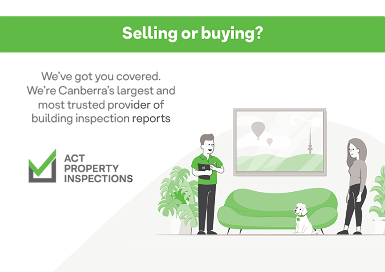
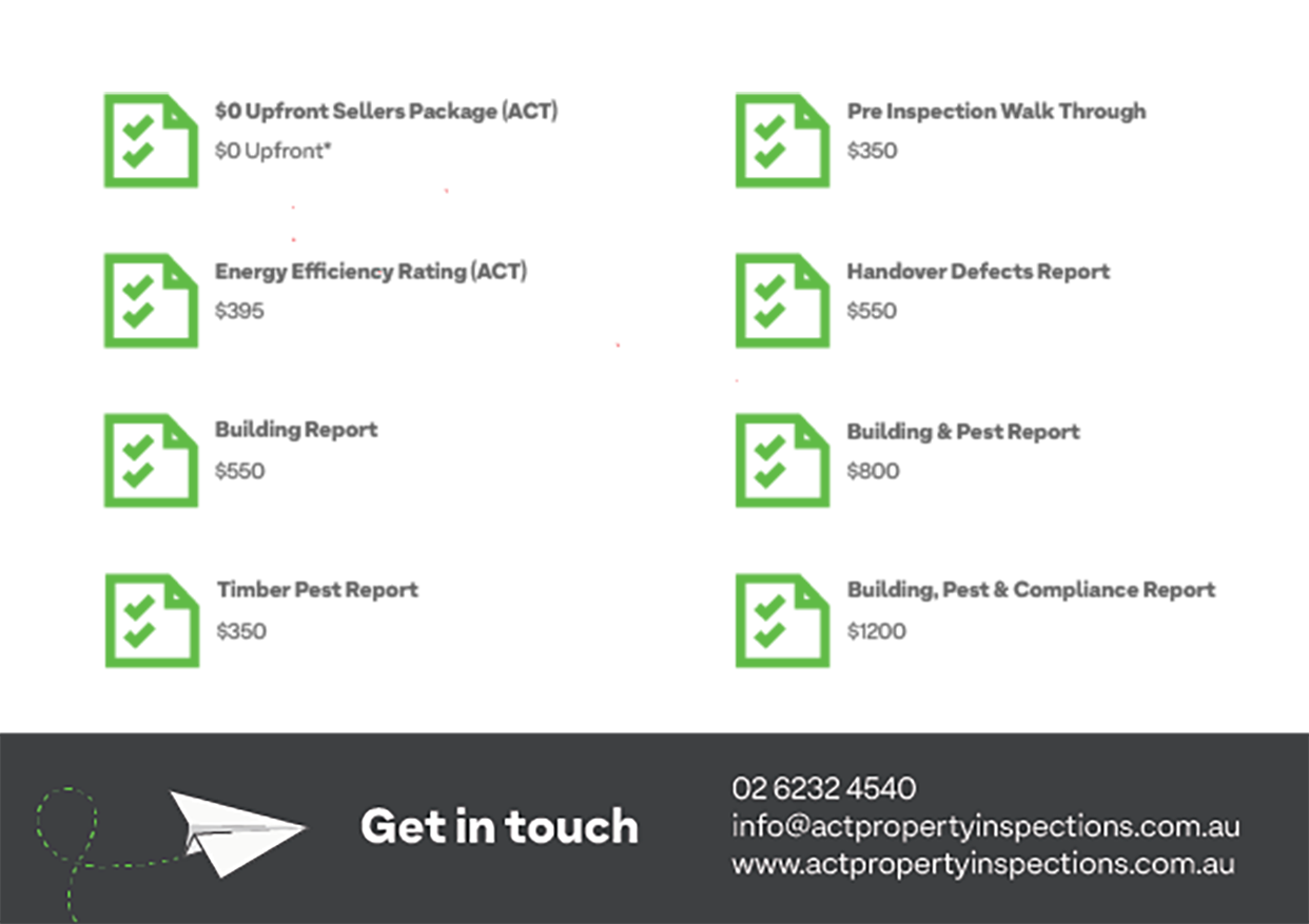
ACT Property Inspections
I designed this A5 postcard flyer for ACT Property Inspection to seamlessly extend their existing brand across a new piece of promotional collateral. With an established logo, colour palette, typography, and illustration style already in place, the brief was to create a flyer that felt consistent with their current marketing materials while presenting information in a clear and engaging way. The challenge was to maintain the brand’s minimal aesthetic while ensuring the message remained accessible and easy for potential clients to absorb at a glance.
Using their existing visual assets, I developed a clean layout that incorporated the company’s signature illustrations, structured spacing, and bold typography to create a strong visual hierarchy. Large text formatting was used to improve readability, while the restrained design approach helped the content feel professional without becoming overcrowded. The final piece stays true to ACT Property Inspection’s established identity, delivering a polished and cohesive flyer that strengthens their brand presence across both print and direct marketing channels.
CASE STUDY 03
Event Campaign Design for Live-Streamed Industry Panel
Hannah Firth - Future Landscape of the Music Industry
For this project, I collaborated closely with Hannah and her team to create a cohesive suite of promotional materials for a live‑streamed panel event featuring industry professionals discussing the future of the music industry. The client supplied the logo, headshots, example artwork, and a defined colour palette, which I carefully considered to ensure visual consistency and strengthen the event’s overall identity across every asset. The aim was to produce materials that were not only visually striking but also fully aligned with the event’s professional tone, audience engagement goals, and practical display requirements.
I was tasked to design the A4 and A3 posters, optimised for different display contexts, alongside tailored social media assets including a Facebook cover and Instagram graphics that spotlighted each keynote speaker, plus additional supporting posts for broader promotion and schedule highlights.
Using Photoshop and InDesign, I focused on hierarchy, layout, and visual storytelling to create designs that captured attention, reflected the energy and forward‑looking vision of the event, and effectively drove engagement across multiple channels.
CASE STUDY 04
Product catalogues
Sydney Poultry
I worked with Sydney Poultry to design a series of product catalogues that showcased their poultry range in a clear, premium, and customer-friendly format. The brief was to create a simple and clean layout that allowed each product to stand out while still delivering important supporting information such as product descriptions, nutritional details, and cooking instructions. The design needed to feel professional and easy to navigate, helping customers quickly understand each product while reinforcing the quality of the brand.
To achieve this, I developed a layout that placed large product imagery at the centre of each page, allowing the photography to do much of the visual storytelling. Supporting content was carefully structured with large, easy-to-read typography and a consistent hierarchy that made key information instantly accessible. By keeping the design minimal and uncluttered, the final catalogues present the products in a polished and appetising way while making the content practical for both retail and wholesale customers to use.
CASE STUDY 05
Pituitary Awareness
Month Event Posters
Australian Pituitary Foundation
I was engaged to design a series of event posters for Pituitary Awareness Month on behalf of the Australian Pituitary Foundation, creating three location-specific versions for Melbourne, Victoria, and Queensland. The brief centred around developing a warm, inclusive visual identity that would resonate with patients and families while clearly communicating key event information. I approached the concept with a strong focus on community and support—using approachable layouts, uplifting colour palettes, and family-oriented imagery to reflect the welcoming, patient-focused nature of the event.
The posters were developed using Adobe Illustrator and InDesign, beginning with initial creative concepts that explored tone, hierarchy, and visual storytelling. From there, I refined the designs through an iterative process—balancing informative content with engaging visuals to ensure the posters worked effectively across both digital and print formats. Careful attention was given to layout consistency across all three versions while allowing for subtle localisation. The final outcome is a cohesive and accessible set of designs that not only promote the event but also reinforce a sense of connection, awareness, and community engagement.
CASE STUDY 06
Advertising upgrade brochure
Purplebricks Australia
I designed this Advertising Upgrades Brochure for Purplebricks Australia as a freelance designer, creating a clean and highly visual piece that clearly communicates a range of property marketing options. The goal was to present complex information—different upgrade tiers, formats, and pricing—in a way that felt accessible, engaging, and aligned with the brand’s bold, recognisable identity. Using a combination of structured layouts, strong typography, and curated product imagery, I developed a brochure that balances clarity with visual impact, helping agents and clients quickly understand the available offerings.
The project was delivered using Adobe InDesign and Photoshop, where I built the layout system, refined imagery, and ensured consistency across all pages. I collaborated closely with the Lead Designer and Marketing Director to align the creative with broader campaign objectives, iterating on feedback to achieve both brand consistency and commercial effectiveness. The final result is a polished, print-ready piece that elevates the presentation of Purplebricks’ advertising products while supporting their sales and marketing strategy.
CASE STUDY 07
Campaign promotional material
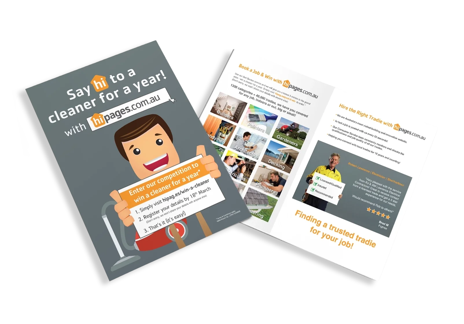
hipages.com.au
Collaborating with the Hipages’ marketing manager and the external agency in charge of the advertising campaign, I created a suite of promotional materials for their new advertising campaign in the Wollongong region. The goal was to raise awareness among tradespeople about the upcoming campaign, encourage sign-ups, and reinforce Hipages’ brand as the go-to directory connecting people with trusted trades professionals.
Using Photoshop and InDesign, I designed a promotional brochure, a double-sided flyer, and a branded notepad, focusing on clear hierarchy, engaging visuals, and practical usability for the target audience. By combining strategic layout with creative storytelling, I delivered cohesive, professional materials that effectively captured attention, supported the campaign objectives, and strengthened the brand’s presence within the local trades community.


Let’s create something purposeful
If you’re looking for a designer who values clarity, impact, and strong execution—let’s connect.